From a website redesign to a Citizen Experience programme
How I rethought the way Milan serves its citizens, starting from ten separate projects that turned out to be parts of one experience.
Overview
The original brief was to redesign the institutional website of the City of Milan.
Eighteen months later, the website was only one part of the system we were designing. Around it had grown a Citizen Experience programme: ten initiatives orchestrated as one system, 628 services mapped across 18 city departments, and a method the administration began to adopt as its own.
The reframing began at the kick-off, when ten initiatives that looked like separate projects turned out to be parts of the same citizen experience. The website was one of them.
My work started there: reframing the brief and making the system behind it visible, so that a website redesign could become a programme of service transformation.
At a glance
Redesign the City of Milan's institutional website in line with Italian public-sector digital guidelines, with a clearer information architecture, an accessible interface and a headless content model.
The website was reframed as one node in a broader Citizen Experience programme, connecting engagement, services, support and monitoring.
I worked as Senior Experience Designer across research, service strategy, information architecture, stakeholder alignment, interaction principles and programme orchestration.
- Citizen Experience programme framing
- Hero journeys and service blueprints
- New website information architecture
- Taxonomy reduced from 24 areas to 17 citizen-facing Topics
- Redesigned service pages and booking flows
- Service mapping across 18 departments
- Evaluation radar across six service-quality dimensions
- Switch-off plan for paper-based service forms
- Electronic ID card (CIE): appointment waiting time reduced from 67 to 5 days
- NPS increased by 27 points
- CIE service delivery increased by 9.5%
- Contact-centre requests reduced by 10% in 2024 compared with 2020
- 628 services mapped across 18 city departments
- 166 services identified for short-term digitalisation
- TARI (waste tax) campaign reached a 51% click-to-booking conversion rate
Evidence
Research
The work rests on evidence gathered with citizens and the people who run the services.
System
The contribution held at programme level, above any single project.
Decision
Choices carried real institutional trade-offs and stayed owned by the departments they touched.
Interface
The same rigour reached a single screen, where wording shifts what a citizen does.
The brief was too small
The City's request was clear: redesign the institutional website in line with the guidelines of AgID, the Italian digital agency, for public-sector digital services. It had to be accessible, organised around the City's thematic areas and services, and built on a headless architecture separating content from presentation.
On paper the work was linear: read the existing system, bring evidence, redesign the information architecture, deliver a robust website. Complex, but governable.
Then the project revealed its real scale. At the kick-off, the website stopped looking like the object of the project and became the surface of a larger system. The Directorate was already running several initiatives at once: proactive campaigns, centralised notifications, AI-powered support, contact monitoring, a Support Centre redesign, service flows, content models. Each had its own owner, timeline and logic, and none had been framed as part of the same experience.
The risk was clear: we could deliver a compliant, more usable website and still leave citizens facing an administration that spoke with a different voice across every channel and department. The website was the visible surface of a deeper problem, the absence of orchestration across initiatives that should have worked as one.
Making the system visible
The first move was to map the initiatives on a single surface. Once the projects sat together, the overlaps showed: notifications and proactive campaigns were both about how the administration reaches citizens; the Support Centre and AI-powered support both about resolving doubts before a citizen makes contact; contact-reason monitoring could have informed campaigns, though that loop had never been closed. The pattern existed; it had never been seen as a whole.
Our first proposal was a solution catalogue: seven interventions, grouped by stage of the citizen relationship, each with a rationale, effort estimate and dependencies. It was structured but too open, with no hierarchy and no narrative spine. So we changed the format. Instead of a menu of solutions, we reframed the work around hero journeys, complete citizen experiences that could act as the backbone of the programme. The question shifted from which solution to build to which experiences the system should support, and that made the programme discussable.
In the next workshop, alongside the hero-journey framing, we presented the ten initiatives organised across four phases of the citizen relationship:
Engagement, Services, Support, Monitoring.
The arrows between them mattered. Monitoring informed campaigns, campaigns prepared access to services, services fed support, and support generated the monitoring data. What had looked like separate projects became a cycle.
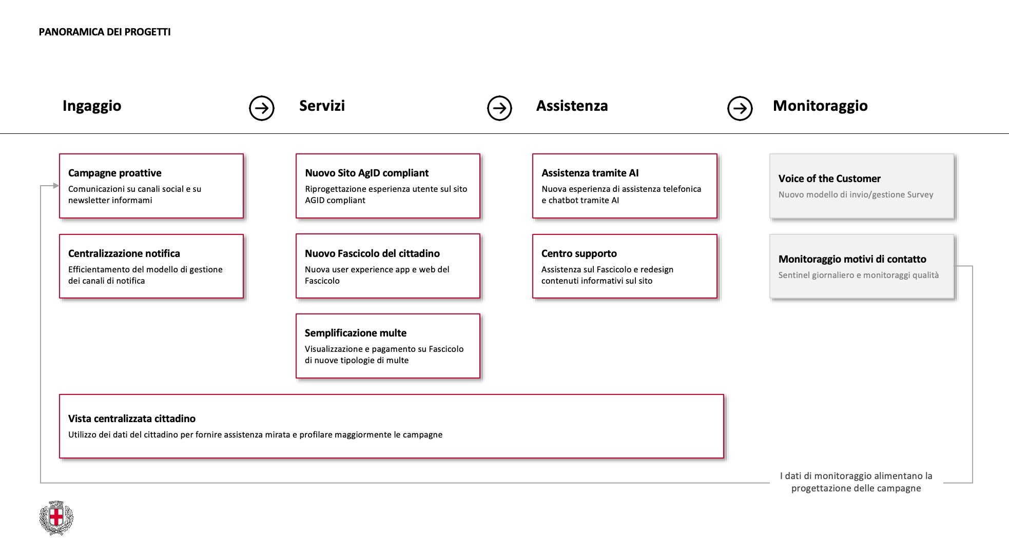
For several project managers, it was the first time their initiative appeared as part of a sequence, and orchestration moved from an idea to a picture.
From there, we proposed treating the website as one node in the broader programme. Its ambition was summed up in the working name Fare di più, con meno, do more with less: for citizens, easier access to services; for the administration, less avoidable demand on support channels through clearer, more proactive design.
The Directorate accepted the reframing because it did not erase the work already under way; it gave that work a higher-order structure. No project owner lost their domain. What changed was the altitude from which the work was seen. To keep the reframing in step with how the work actually moved, I joined the project managers' weekly meetings for the rest of the programme: a strategic proposal in a public administration survives only when it matches the operational rhythm.
Designing for citizens, and for the people who serve them
Public services create a specific design condition: a citizen usually cannot choose another provider. That changes the nature of responsibility, because the service is often the only route to something necessary, and its design is judged by public value rather than market preference. At the same time, it reaches the citizen through layers of administrative mediation: departments, civil servants, public managers, legal constraints, political ownership, legacy processes.
The designer can and must listen to citizens directly. Yet the service, once designed, is operated, maintained and defended by the administration. The listening is direct; the delivery, mediated. Designing for both at once is the specific craft of public-sector work; ignoring either side produces tools that only work halfway. The decisions that follow make sense only with that in mind.
Research as a shared operating ground
The programme was grounded in research with citizens and operators: hero journeys, ethnographic interviews, pain-point mapping and workshops with the Directorate. The findings were not surprising. Citizens struggled with waiting times, fragmented information, unclear responsibilities across departments, and the feeling of explaining their situation from scratch at every contact.
What the research gave us was alignment more than novelty. It became the shared ground for decisions: instead of negotiating design choices as preferences, we could return to observed pain points, service evidence and citizen needs. From that point on, research stopped being a phase of the project and became the infrastructure for the conversations that followed.
Taxonomy as mediation
The first major translation between citizen needs and institutional structure was the website taxonomy. The City had historically kept 24 thematic areas, many grown from administrative logic rather than from how citizens search for services. Green areas and Environment sat apart, although most citizens would not know the distinction; Culture and Business overlapped around creative activities; Districts had no associated services; Statistics had no services and accounted for 0.2% of visits.
Redesigning the taxonomy was an act of institutional mediation before it was information architecture. Each area answered to a department, a political owner or an internal responsibility, so every merge or removal carried an organisational cost. The work had to stay legible to citizens and maintainable by the administration.
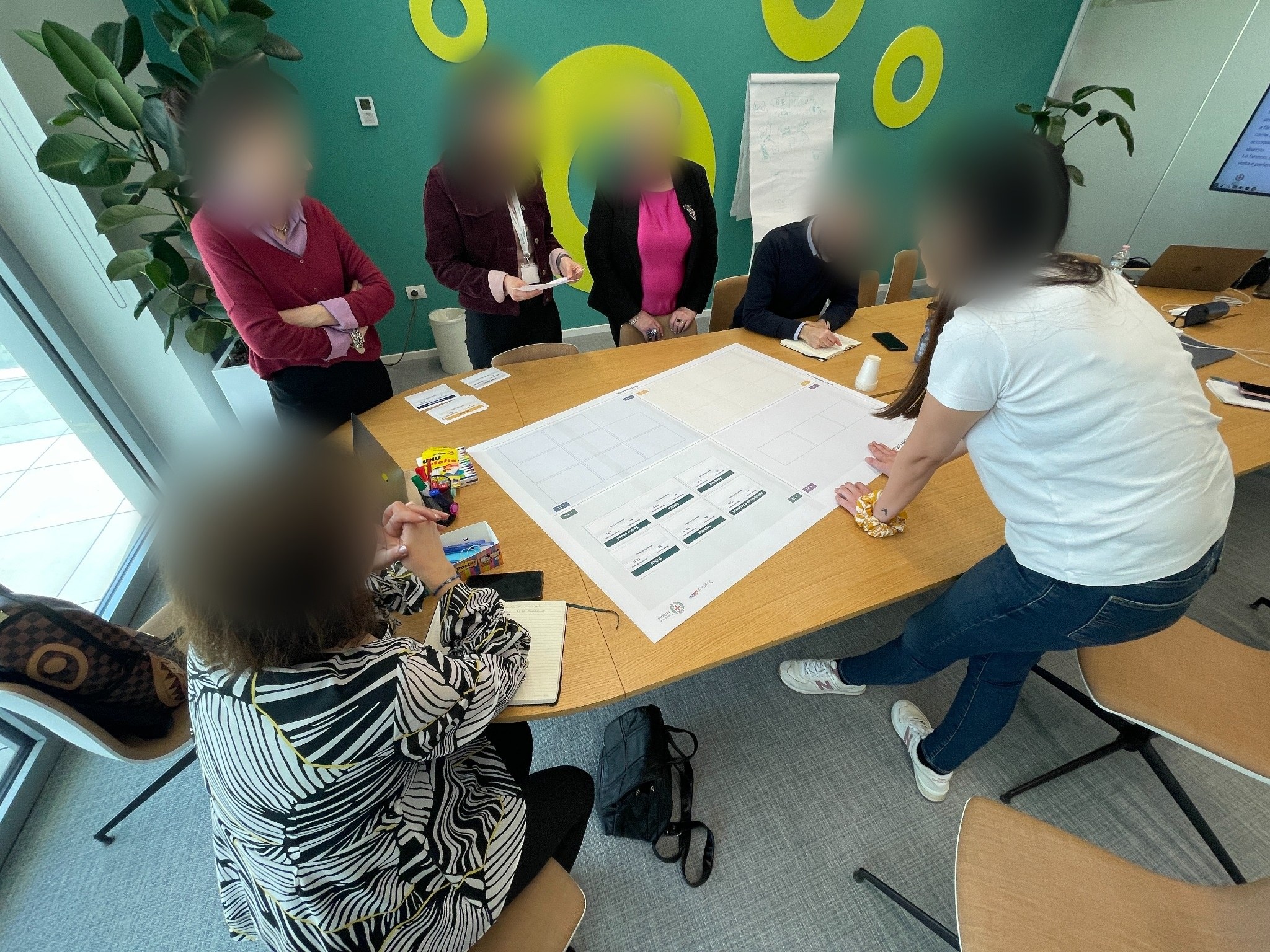
In May 2024 we ran a taxonomy workshop with the Citizen Experience and Communications Directorates. On the table was a physical matrix of the existing areas, their service volumes and visit data, and the proposed topics; every change had to be justified on both user evidence and institutional feasibility. At one point, someone observed that it was the first time the taxonomy had been discussed in terms of what citizens looked for, rather than how the administration was organised. That sentence became a reference point for the decisions that followed.
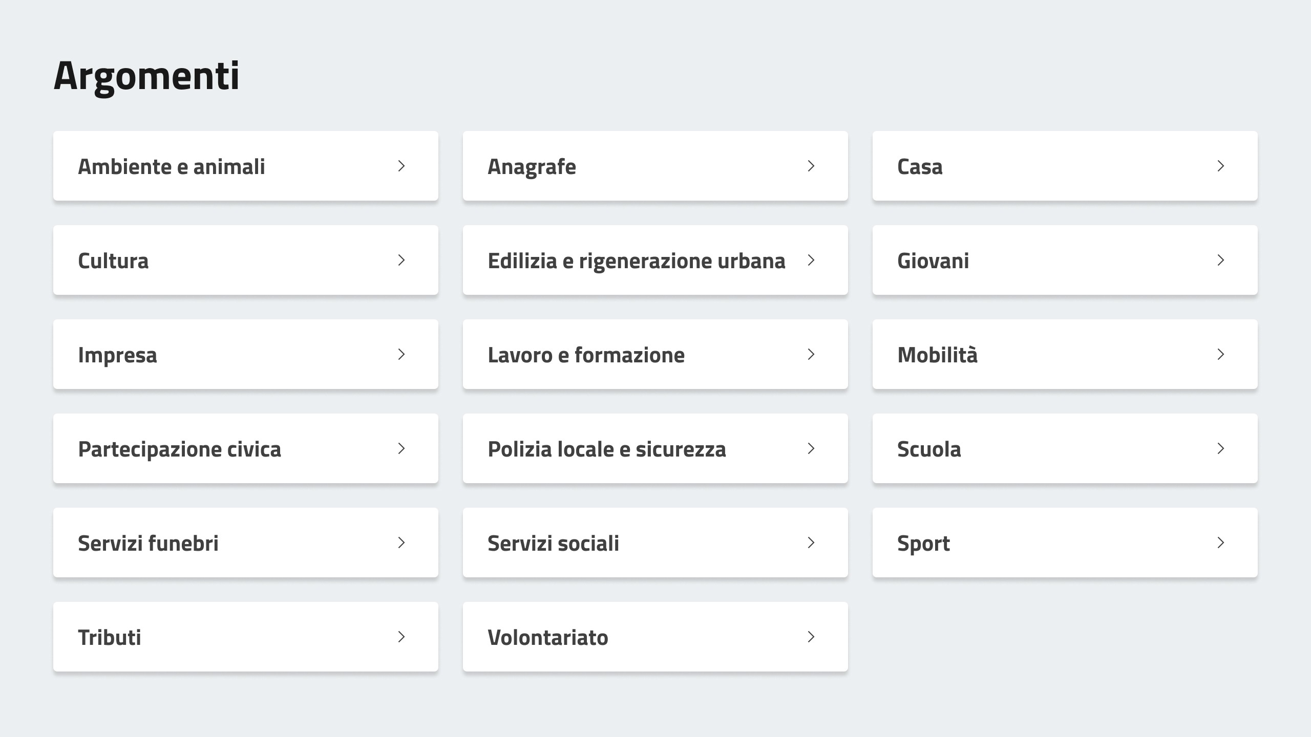
The final taxonomy reduced 24 areas to 17 Topics. The reduction mattered because every Topic had an owner, and every owner had accepted the mapping: a structure citizens could navigate and the administration could maintain. Each Topic then followed the same pattern: an opening page, associated services, deep-dive content and related news. Culture, Mobility, Registry, Taxes: different subject matter, one grammar a citizen could learn once and reuse.
Decisions with trade-offs
The website we delivered was a system of 140 templates applied to thousands of content pages, and within it a few decisions carried more weight than the rest.
The homepage: from reading to doing
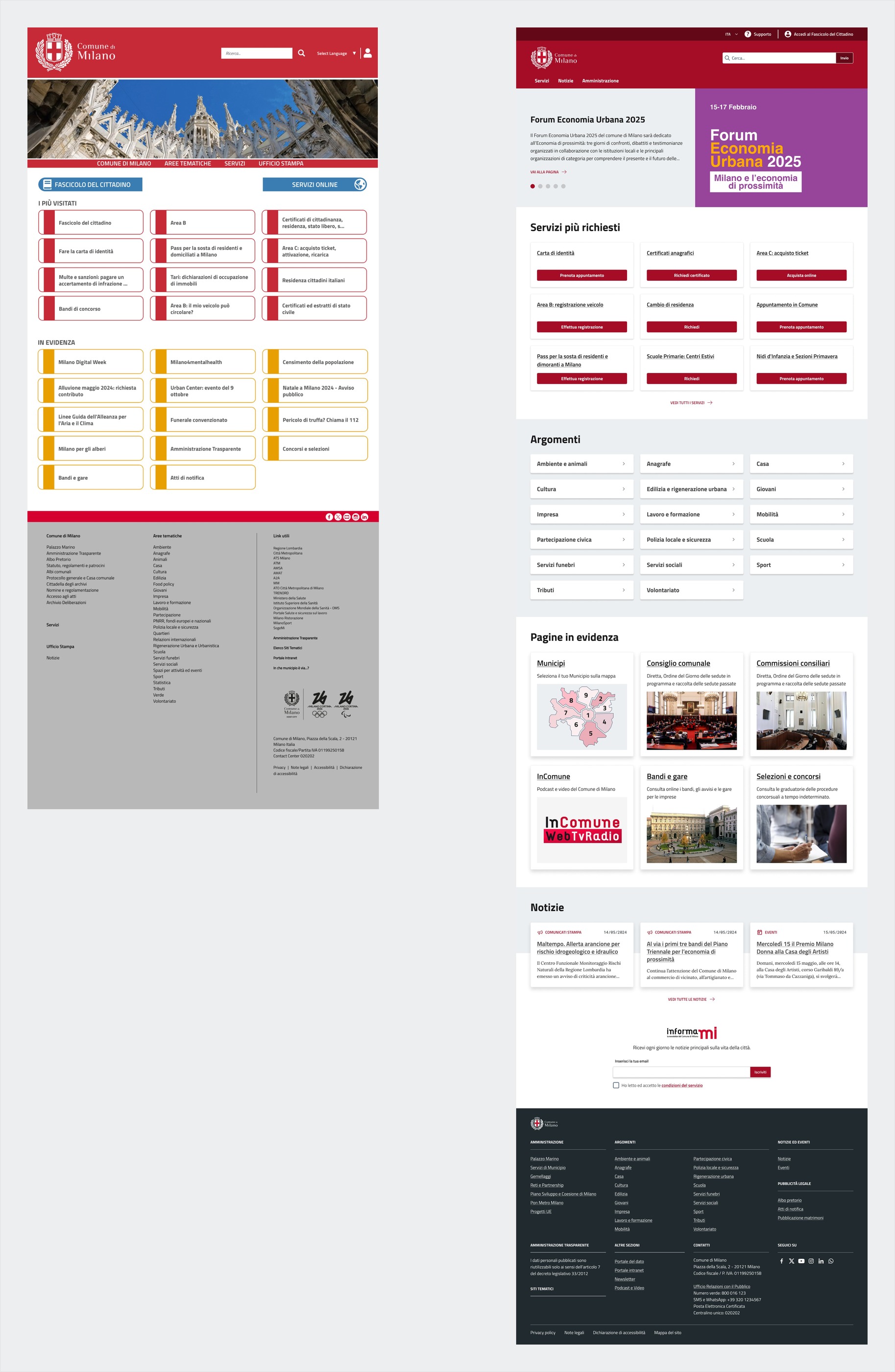
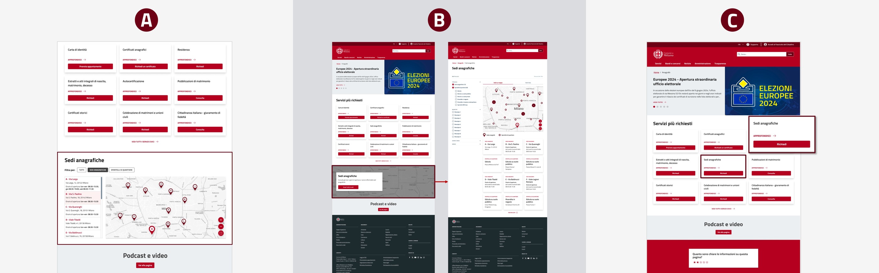
The City's homepage had historically served many functions at once: institutional communication, news, events, services, administrative information. The principle we applied was simple: build the homepage around what citizens come to do. The new homepage gives priority to the most requested services, the electronic ID card, registry certificates and extracts, reachable in a single click, while institutional news stays present, lower on the page.
The decision required negotiation. The Communications Directorate was used to strong visibility for news and campaigns, and moving services above the fold reduced that exposure. The argument was made through evidence: traffic logs showed most visitors arrived from search engines looking for a specific service, not an institutional update. The old homepage asked citizens to read; the new one asks them what they need to do.
Before
Institutional news and communication dominated the entry point.
After
High-demand services moved above the fold.
Why it matters: the homepage shifted from asking citizens to read to helping them act.
The service page: do not front-load complexity
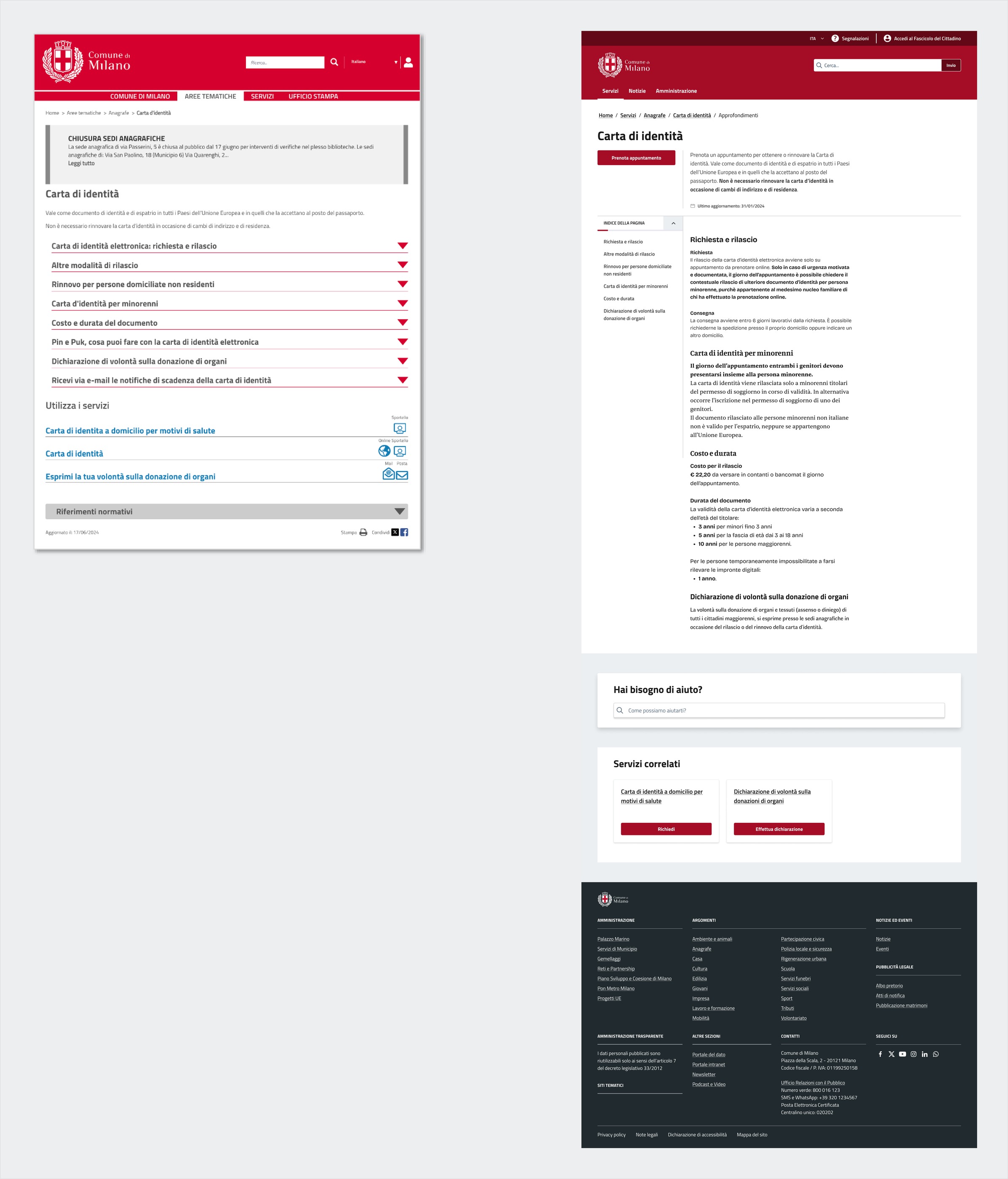
A municipal service page is often the point where a citizen decides whether to proceed or abandon. The previous pattern, common across Italian public administrations, placed complexity at the start: legal requirements, exceptions, eligibility cases, regulatory references. We reversed the sequence, on a single principle: do not front-load complexity. The new service page opens with what to do and how to proceed, and complexity appears when it becomes relevant. Someone who only wants to book a CIE appointment should not have to read exceptional renewal cases first.
The administration's objection was legitimate: moving legal requirements lower could create risk in edge cases. Rather than remove complexity, we made it navigable on demand, at the moment it matters.
Key decision
Do not front-load complexity
The common pattern placed legal requirements, exceptions and regulatory references at the start of a service page, where a citizen decides whether to proceed or abandon.
Open with action and guidance; reveal requirements when they become relevant, navigable on demand.
Legal information stays complete and accessible, moved lower on the page, so edge cases remain covered.
Complex topics: coherence over local optimisation
Some municipal topics are constellations of needs rather than single services. Housing, for example, gathers calls for applications, benefits, certifications and municipal property. For these, we weighed three options.
Option one
Enrich the existing Topic pages with subsections. Preserves SEO and template coherence, but risks overloaded containers.
Option two
Create dedicated landing pages outside the Topic structure. Maximises clarity, but breaks the system and complicates maintenance.
Option three, chosen
Introduce an intermediate layer between Topic and service, a second-level page for complex subtopics, in the same grammar.
We chose the third, because it was the one that held on both sides, the citizen who searches and the administration that maintains.
Making complexity arrive at the right time
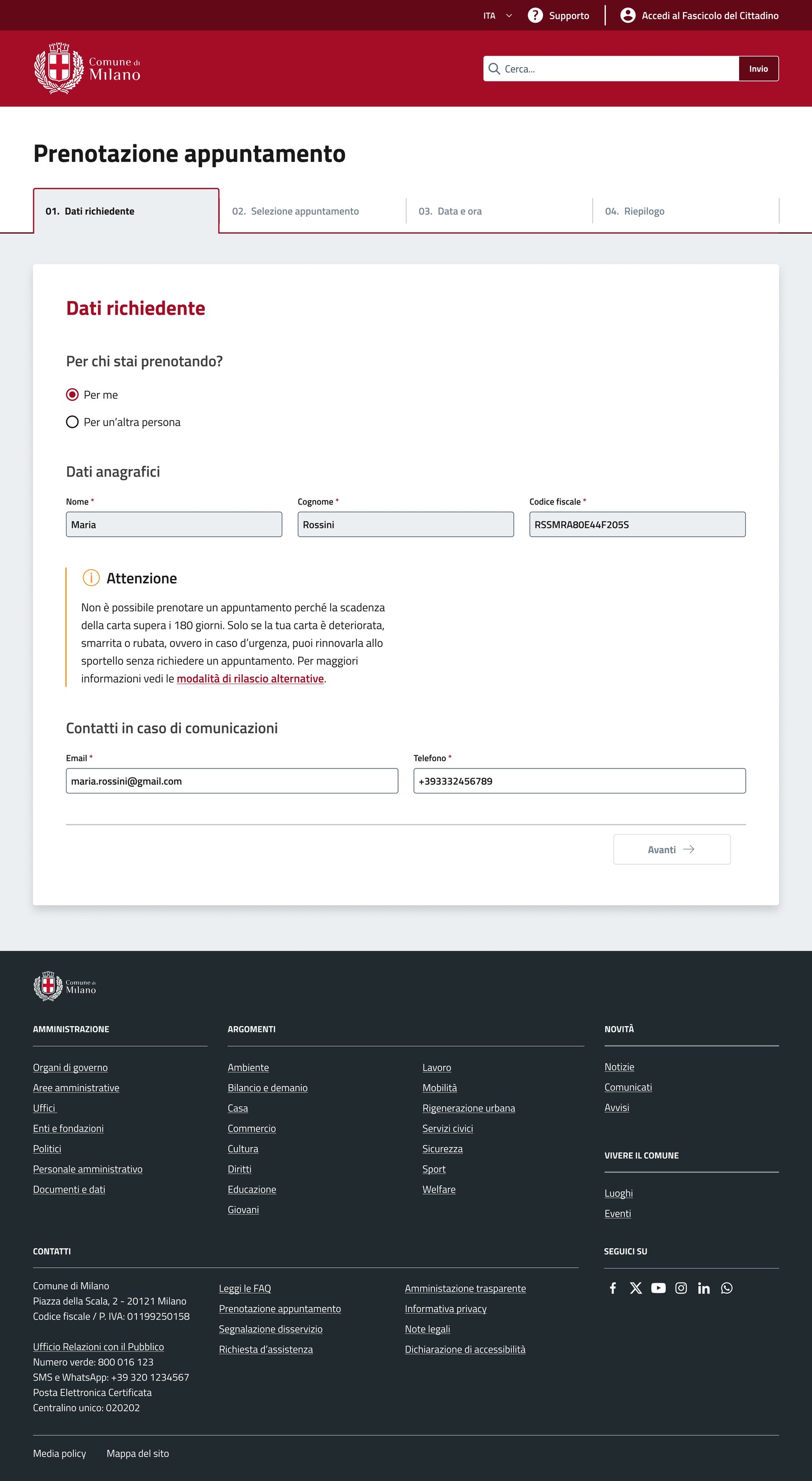
The principle of not front-loading complexity became most measurable in the electronic ID card flow, where the difference between before and after is clearest. Average waiting time for an appointment went from 67 to 5 days, NPS rose by 27 points, and CIE service delivery increased by 9.5%, from 183,000 to 200,000 issued cards between January and November. The numbers show that the system worked; the design question is how.
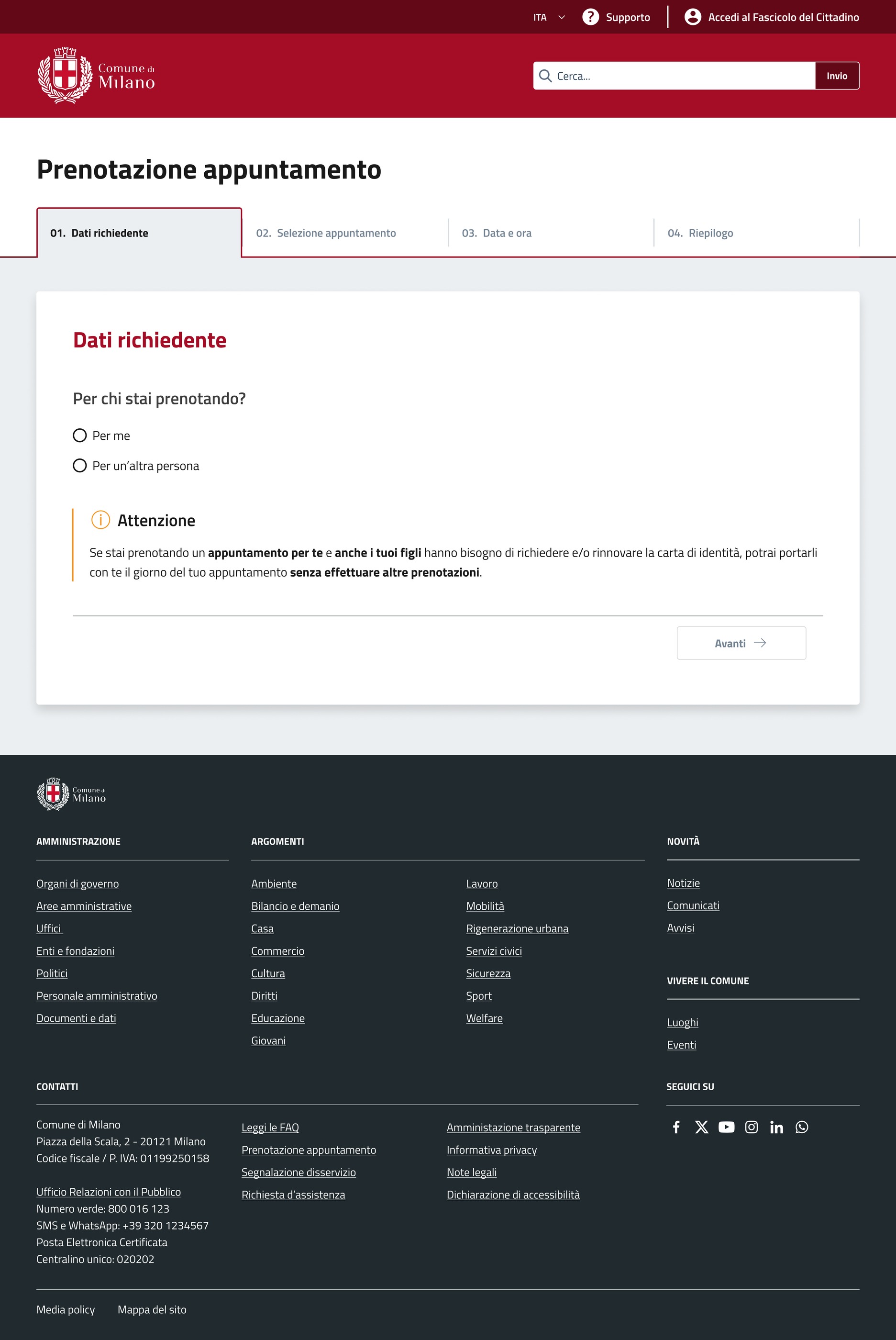
The flow starts from the service page. Most citizens arrive from Google, the real entry point for many public services, landing on a page that explains what to do before booking. At the first step, before any data is entered, an alert asks whether the citizen already holds a valid card and suggests checking the expiry date, addressing a recurring source of unnecessary bookings by people who thought they needed a new card when they did not.
That alert took weeks of work on a single step, and I defended its exact wording internally against a reasonable concern that it might confuse people. It held because testing showed the message worked as intended.
The location map shows each office's urgency, based on real attendance data, so a citizen can see where an appointment will come faster. At confirmation, the system sets out what to bring, where to go, when to arrive and what happens next, and repeats it by email. The flow does not remove administrative complexity; it places it in time.
Side note
The 180-day alert
One micro-decision explains the principle better than any general description. By law, a citizen can book a CIE appointment only from 180 days before the current card expires; before that threshold, the system cannot accept the booking. Most public systems treat this as a technical error: the citizen tries to book, receives a blocking message and leaves, often without understanding why. We treated the threshold as a moment of service. The alert explains how many days remain before booking opens, shows the exact date the citizen can return, and offers an email reminder, so the citizen leaves with useful information rather than a failed transaction.
Support as part of the service
The Support Centre closed the loop. If the website is the access point and the flows the point of delivery, support is where citizens go when something is unclear, broken, or not yet ready to start. The principle: prevent contact when possible, qualify it when necessary.
On service pages, every service carries contextual FAQs from real contact-centre data: the questions citizens actually ask about that service, placed where the doubt is likely to arise. When contact is necessary, the system structures it. The pothole-reporting flow guides a citizen through location, photo, description and category, then routes the request automatically to the competent department. The citizen knows what happened to their report; the operator receives a qualified, already-routed request.
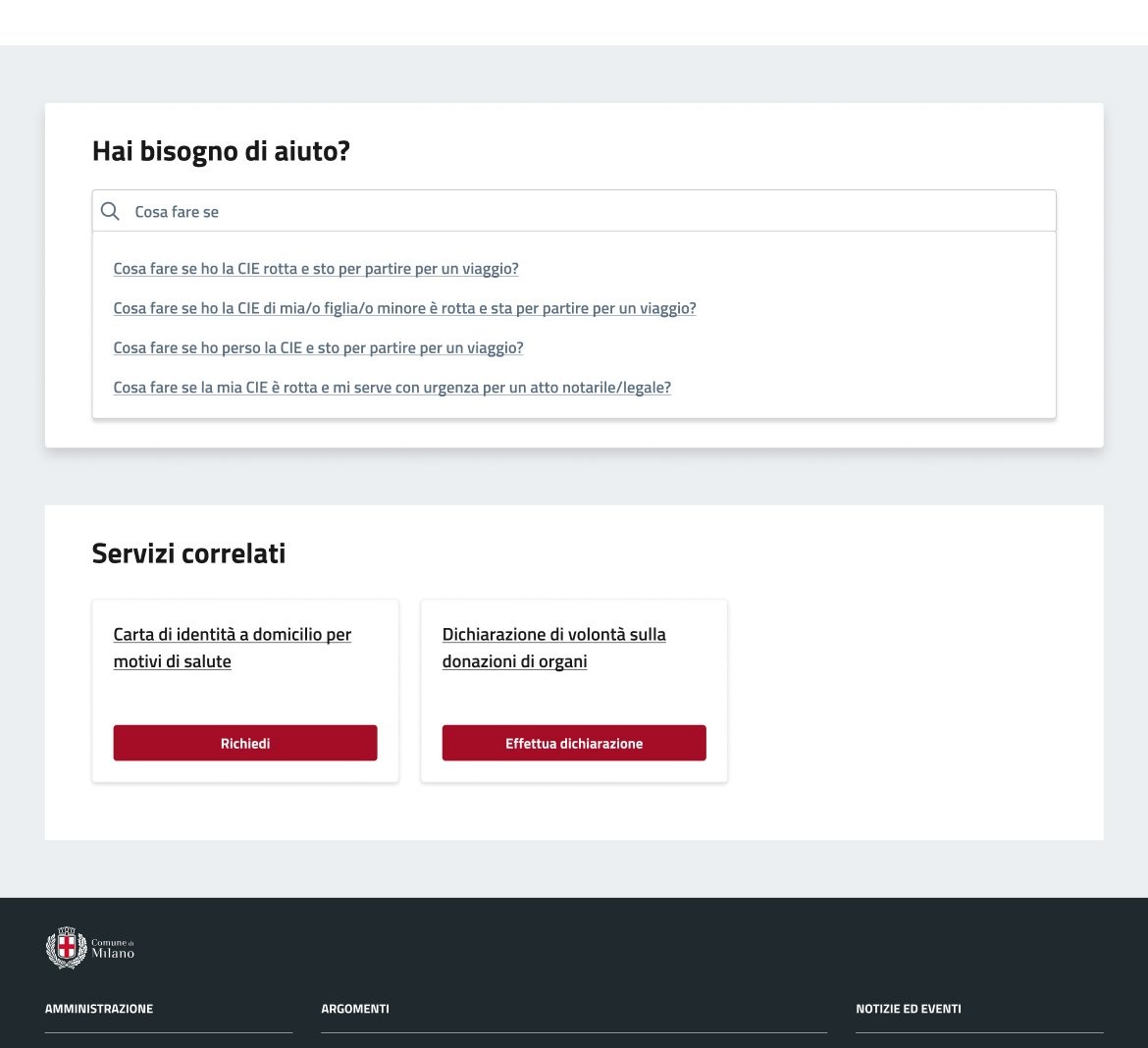
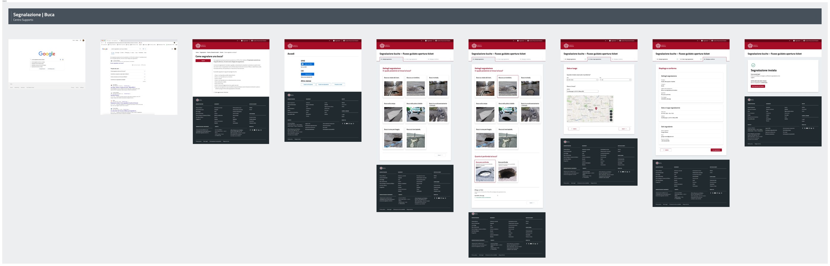
In 2024, contact-centre requests fell by 10% against 2020, with a 50% reduction targeted by the end of 2026. The four-year interval includes factors outside the programme, so the figure reads as a direction rather than an isolated cause, yet it is consistent with the service logic: when a system answers the question before the contact, the contact becomes less necessary.
A good public service is a promise the administration keeps without making the citizen see the effort behind it.
The work on the website, the CIE flow and the Support Centre was work on that promise.
When the programme became bigger than us
The programme did not end with the redesigned website. Once the method proved useful across different projects, the question inside the administration changed from whether it had worked to where else it could be applied. The scope expanded beyond the Citizen Experience Directorate to 18 general departments across the City: registry, taxes, construction, mobility, schools, housing, environment, local police, social services and more.
To understand where to intervene, we mapped 628 services. The picture was uneven: only 44% were effectively available online, 26% still ran on paper forms, and 75% were reachable through two or fewer channels. For each service we built evaluation radars across six dimensions: digitalisation, accessibility, information quality, multichannel presence, integration with the Citizen File, and monitoring. The radar made service maturity visible across the organisation: each service comparable, each department able to see the work ahead.
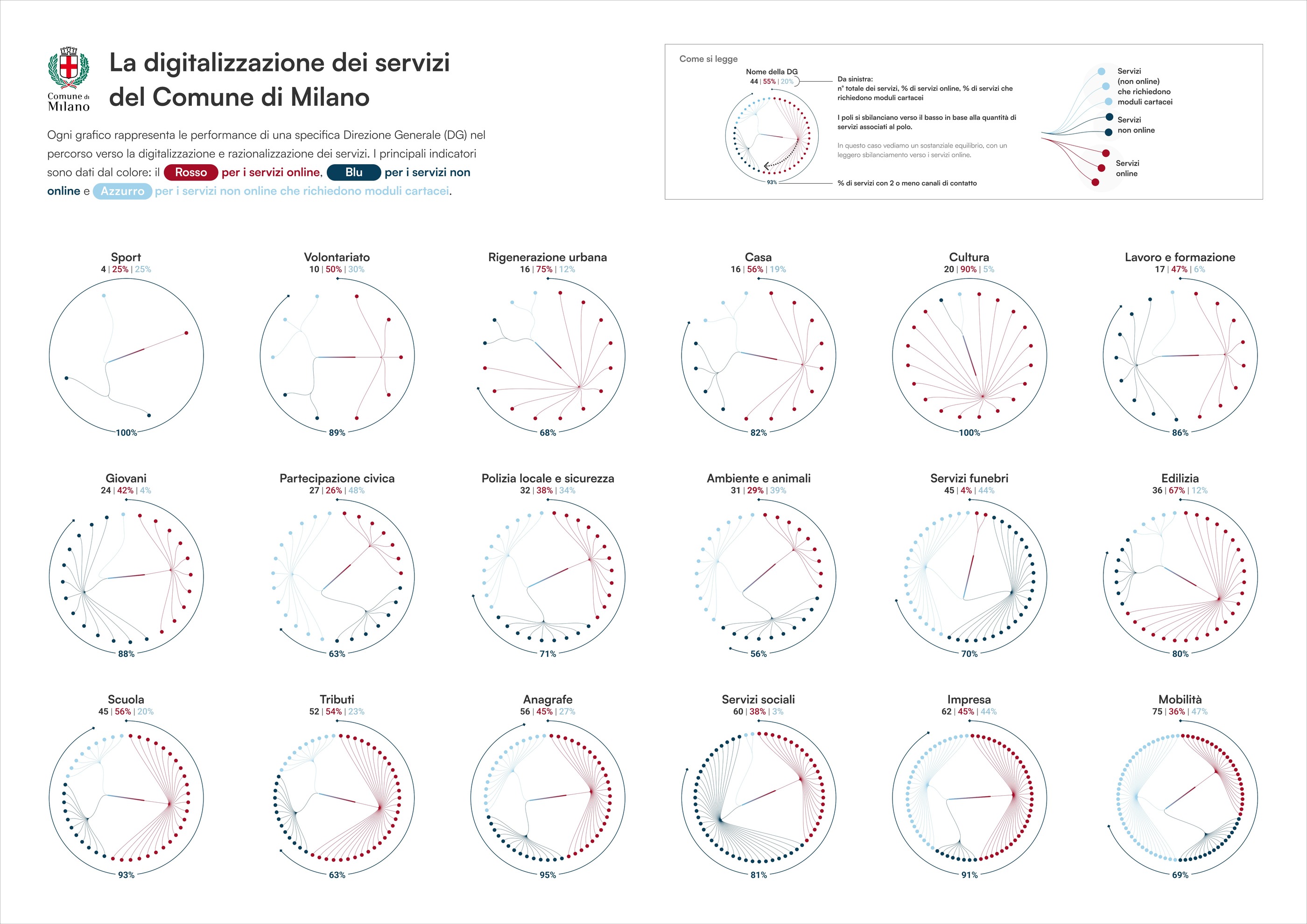
In April 2025 the programme presented a switch-off plan for paper forms: 166 services suitable for short-term digitalisation, with an incremental approach that managed change inside each department without disrupting delivery. The plan was accepted and the work is now under way. This was where the project clearly stopped being a website redesign and became part of a wider shift, from treating digitalisation as a sequence of projects to treating it as a permanent organisational capability.
An honest gap remained between what the programme mapped and what could be redesigned at once. Of the 628 services, the first phase focuses on 166 not yet online; these join the 276 already delivered digitally, now undergoing user-experience optimisation, while another 186 remain in the pipeline, mostly informational or lower-priority. That gap matters: the citizen experience changed where the system itself began to change, and elsewhere more time is still needed. A serious programme should be able to say that without pretending the transformation is complete.
What remained after us
At the start I thought I had what I needed: a clear brief, AgID guidelines, benchmark material, access to project managers. For the first months we designed the website from there, yet the work felt weaker than it should have, and for a while I could not name why. The reason was that the website rested on a layer we had not yet stabilised, and no amount of surface design could compensate for that instability. That is the lesson I took from the programme: in public services, starting from the first brief before framing the wider system costs more than it seems.
The clearest sign that public-sector design has worked is what the administration starts doing on its own, during the project and after it. In the final months I noticed a change in internal conversations. Criteria we had introduced, ways of assessing options, the principle of not front-loading complexity, the habit of testing sustainability for both users and maintainers, began appearing in meetings we were not leading. New tools and flows were being assessed through a vocabulary that had become shared. The method also moved upward: conversations that began with project managers came to involve unit leads, then directors, then the general director, and the questions shifted from individual decisions to how that reasoning could be replicated elsewhere.
Design entered the administration's operational vocabulary. For me, that is the strongest sign that the programme had outgrown its original perimeter.
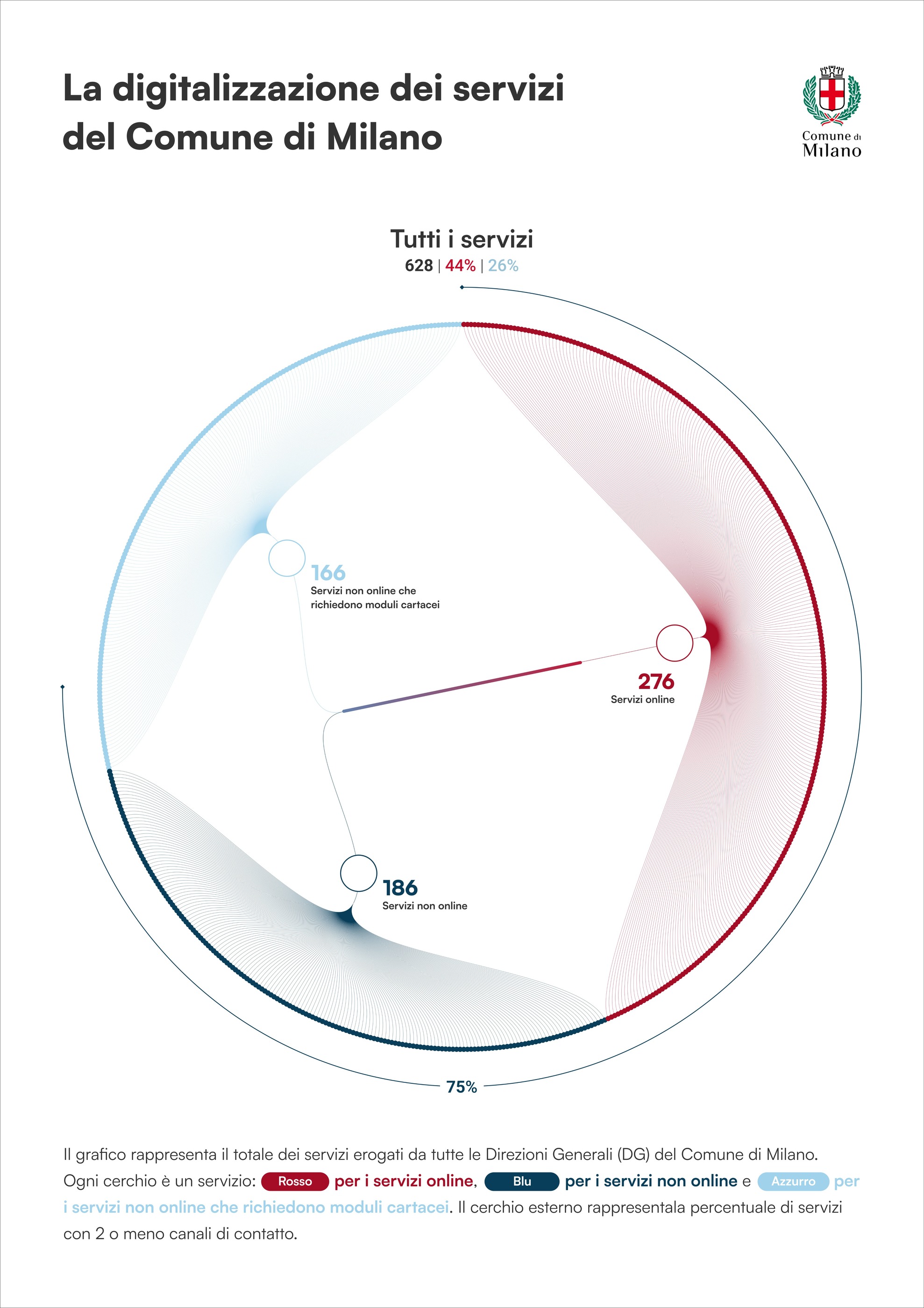
The radar is the programme in a single view, a tool the City can use to navigate the work ahead.
The programme became bigger than us.
For a designer working in public services, there is no better result than becoming less necessary.
Afterword
Transformation is the word we attach to work that changes little: a category wide enough to hold any project of a certain size, whatever it actually moves. What eighteen months in Milan taught me is that real transformation in a public administration begins with how the people inside start to think about the services they run. A new website, a redesigned service page, a faster booking flow are the visible signs of a change that happened earlier: in the meeting where someone asks how the citizen will see this, without the designer prompting it; in the project manager who weighs a new tool by who will maintain it in two years; in the matrix of criteria redrawn on the whiteboard, used now because it is part of how people reason. A transformation that has changed how people think has already done the hardest part.
Everything that follows is its visible expression.